


Why Choose Us?
0% AI Guarantee
Human-written only.
24/7 Support
Anytime, anywhere.
Plagiarism Free
100% Original.
Expert Tutors
Masters & PhDs.
100% Confidential
Your privacy matters.
On-Time Delivery
Never miss a deadline.
Refer to the Lincolnville School District bus data
Refer to the Lincolnville School District bus data. A. Refer to the maintenance cost variable. The mean maintenance cost for last year is $4,552 with a standard deviation of $2332. Estimate the number of buses with a maintenance cost of more than $6,000. Compare that with the actual number. Create frequency distribution of maintenance cost. Is the distribution normally distributed. Refer to the variable on the number of miles driven since the last maintenance. The mean is 11,121 and the standard deviation is 617 miles. Estimate the number of buses traveling more than 11,500 miles since the last maintenance. Compare that number with the actual value. Create frequency distribution of miles since maintenance cost. Is the distribution normally distributed?
Expert Solution
Answer:
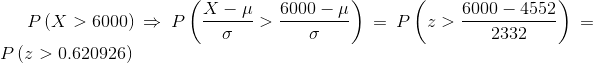
The population mean and standard deviation is,
The probability that a maintenance cost is greater than $6000 is obtained by first converting the normal distribution to standard normal than the probability can be obtained using the standard normal distribution table,

For 80 buses, the total buses with maintenanance greater than 6000

From the provided bus data with sample size = 80, number of buses with maintenance cost greater than 6000 can be obtain using the function in excel =COUNTIF(B2:B81,">6000")
The count = 17 out of 80 buses
The actual count is 17 while the calculated from distribution is 21
The frquency diagram is obtained in excel using the following steps,
Step 1: Write the data values of Maintenance cost in excel
Step 2: Make Bin column with data value 1000, 2000, .......11000.
Step 2: DATA > Data Analysis > Historam > OK. The screenshot is shown below,
Step 4: Select Input Range: Maintenance column, Bin Range: Bin column. The screenshot is shown below,
The output is,
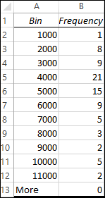
Step 5: Select the Bin and frequency column then INSERT > Recommended Charts > All Charts > Column > OK. The screenshot is shown below,
The plot is normally distributed
Part (b) is same, Comment me if got stuck
PFA
Archived Solution
You have full access to this solution. To save a copy with all formatting and attachments, use the button below.
For ready-to-submit work, please order a fresh solution below.
